My daughter, Annie, just returned from a fabulous holiday in Sicily (a college graduation gift from her most generous aunt and uncle). She had a lovely time soaking up sun on the beach, eating delicious Italian food, and drinking Grappa Chianti. It would seem that she also picked up a bit of Italian while she was there. You know, key expressions like “Si, mi piacerebbe di piu Chianti e dove potrei trovare un partito divertente” (translation: “yes, I would like some more Chianti, and where might I find a fun party?”)
The closest I got to a vacation in Italy this year was eating a plate of spaghetti and drinking a glass of Ripple while I reacquainted myself with the work of the Italian social scientist and economist Vilfredo Pareto.
Clearly, I need to get a life — preferably one just like my daughter’s.
 Anyway, as you may know, in 1906, Pareto noted that 20% of the population in Italy owned 80% of the property. He proposed that this ratio could be found many places in the physical world and theorized it might be a natural law, where 80% of outcomes are determined by 20% of inputs.
Today we know this principle as the “80/20 Rule” or the “Pareto Principle.” The value of the Pareto Principle is in reminding us to stay focused on the 20% (the “vital few”) that matters — because those tasks or problems or factors will very likely produce 80% of our results. Therefore, it’s critical that we identify and concentrate on the elements of the crucial 20%.
There is also a special type of data visualization named in honor of Vilfredo Pareto called a Pareto chart, or a Pareto distribution diagram. This chart is specifically designed to display information that makes the “vital few” stand out from the “useful many.” A Pareto chart uses bars and lines to illustrate which variables have the greatest cumulative effect on a given system, as in the following example of operating room (OR) surgical setup errors by type:
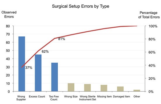
In this example, data was captured on eight different types of errors that occurred when OR teams were setting up instruments and supplies for surgery. The first step to creating the chart was to arrange the bars in order of the magnitude of their contribution to the whole.
(A BIG note of caution here — displaying information on two axes can cause confusion, because the viewers of your chart may not understand that bar height correlates to the primary Y axis, and that the line relates to the secondary Y axis. You need to decide if this additional level of detail truly adds value to your display, or if a simpler one with only one Y axis is a better and more easily understandable way to convey your message. A simpler chart, with only the primary Y axis, appears below.)
For added impact in the first chart (above), I made the bars that cumulatively represent 80% of the errors a different color from the rest of the bars. By using color this way, I was able to group the bars into two distinct subsets and focus the viewer’s attention on the most significant causes of errors — visually separating the “vital few” and making them really stand out. Finally, the data labels I added (37% and so on, in black) show the substantial cumulative value and effect of the categories represented by the first three bars.
We still need to remember, though, that even though there is a difference between those three bars as a group and the remaining bars, there is still a close connection between these two clusters that we also want to display. The addition of a simple horizontal line in red helps link the two groups, and guides viewers of the chart to seeing and grasping the underlying connection from one bar to another. As this thread-like line leads us along, we can tell how all the bars combine to create the whole story.
Now, here’s the same chart (below) without the secondary Y axis (“Observed Errors”). The “vital few” are still apparent; the linking thread still appears; both the separation between and the commonality of the two bar groups are clear. This chart presents somewhat less information, but can gain in clarity and simplicity.
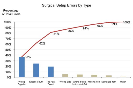
In both charts, the entirety of the combination of the bars and line conveys a clear message: in order to significantly reduce OR surgical setup errors, the organization should focus its efforts on the error categories of 1) wrong supplier 2) excess count and 3) too-few count-Pareto’s “vital few”— first and foremost, before turning to the “useful many,” which have a lesser impact (in relative terms) on the problem.
Used correctly, Pareto charts are a truly brilliant way to show an entire story while helping your audience focus on the biggest opportunities for change and improvement. You don’t have to search for the largest amounts of something that, combined, dominate the whole: they are right in front of your eyes.
Okay, so I didn’t get to go to Italy this year, but I did get to say the name Vilfredo Pareto out loud several times and that felt very close to being there. Give it a try….Vilfredo Pareto, Vilfredo Pareto, Vilfredo Pareto. Now, add a bowl of spaghetti and a glass of red wine and I promise you will be just about there…no lines, no waiting.


0 Comments