I was recently flipping through yet another design-challenged presentation of healthcare data, and started thinking about a project on the Grand Canyon I’d done when I was in the eighth grade. I’d made a model using colored clay to show the earth and the different layers of rock on one side of the Canyon, and I used blue resin to make the Colorado River. I worked long and hard on that project and man, was I proud of it…I knew I was going to get an “A.”
My teacher, Ms. O’Neill, had a different opinion. She gave me a grade of C on the project. To say I was stunned (and indignant) is to put it mildly. Stupid teacher — what did she know, anyway?
Turns out she knew a lot.
Ms. O’Neill patiently explained to me that the reason I’d received a C on my project was that I had only built one side of the Canyon, completely missing the point about what makes the Grand Canyon so, you know, grand. Over a period of nearly two billion years, the Earth’s geological history was exposed, little by little, as the Colorado River cut a deep, narrow passage (with two sides) through the earth.
In my zeal to use the cool clay and resin, I designed a model that ended up looking like a cliff with some water below — and nothing at all like a canyon. I figured the dazzle of my display medium alone was worth an “A” — leave the poster board and markers to the peasants who would earn only a mediocre grade with their simplistic renditions of the Canyon.
I see the same mistake in many displays of healthcare data. People become so enamored of the whiz-bang functionality of the software that they fail to achieve the true power and goal of data visualization: showing the story in the data, simply and clearly.
But I also see another and equally troubling problem. Those who look at — and try to interpret — these displays fail to do what Ms. O’Neill did for me: they don’t challenge the creators to explain how their work tells us what we need to know.
Consider the display shown below concerning patient satisfaction and related factors.
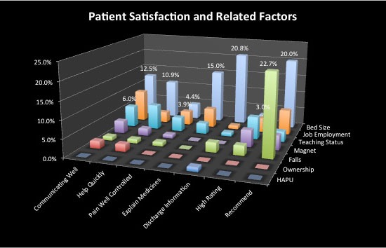
Granted, this looks pretty slick — but I have no idea what it’s trying to tell me. It’s my Grand Canyon model without the canyon. In other words, it is flashy, but it obscures the point of the story. Which leads me to the golden rule for report recipients:
If you don’t understand a data display, say so.
Let go of your fear of looking stupid (or of being a trouble-maker), and of the notion that people who can use software to create a graphic like this know more then you do. They don’t. You can also be pretty sure that if you don’t understand what you’re seeing, it’s likely that no one else does, either.
The whole point of presenting data in a chart is not to dazzle me, or to show me that you know how to use all of the often quite silly, even useless functionality of a software application; rather, the goal is to tell me something new about what the data reveal.
You may not be the person who creates your organization’s data displays — but your interaction with those displays is no less important. You must look past the dazzle of this type of presentation (or any display you don’t understand) and provide frank and honest feedback, so that the data do what they are supposed to: tell us something — in a clear, correct, and compelling way.
When Mark Twain said, “It is better to keep your mouth closed and let people think you are a fool than to open it and remove all doubt,” he had never seen some of the 21st-century data displays — as fancy as they are incomprehensible and useless — that I have!
Go ahead: if you see something that doesn’t say anything, be a little foolish, and open your mouth. You’ll be glad you did.


0 Comments