The other day, I was looking over some reports I’d received from a new client when I came across a doughnut chart. Suddenly, for some inexplicable reason — and to no one in particular — I heard myself quoting Homer Simpson: “Doughnuts — is there anything they can’t do?”
Why, yes, Homer, there is. They can’t display data very well.
The doughnut chart is essentially a pie chart, minus the middle part, hence the also-baked-goods-connected name. As with a pie chart, people will often use doughnut charts to try and display part-to-whole data. Just like a pie chart, doughnut charts don’t do the job very well — as in, not well, period.
Someone looking at a pie chart must try to judge the values it displays by the angle of each piece of the pie — a task that is hard for humans to do. Because there is a hole in the middle of a doughnut chart, we no longer have to struggle with that particular problem. Instead, there is a new challenge: estimating the values displayed based on the arc length of the doughnut’s parts, which (it turns out) is equally difficult to do. Humans just aren’t cognitively wired to see and easily understand data displayed in this form.
And that is just one part of the problem. Like a pie chart, a doughnut chart limits our ability to display, analyze, and use data because of its:
* inability to rank data
* inability to effectively show data compared to a goal or a benchmark
* inability to show multiple categories of data simply and clearly
And yes, I know — we can add lots of labels and arrows and keys and explanations in an effort to provide clarity, but to me this is akin to putting pink frosting and jimmies on a stale old doughnut — lots and lots of stuff that I don’t need and a combination that leaves me feeling lousy!
Check out the following doughnut chart of the percentage of high-risk patients by clinic location:
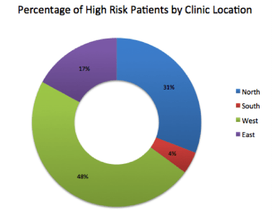
Viewing the data in this doughnut chart, I can see that the red and purple parts are smaller than the blue and green, but even with the percentages noted inside the colored areas, I have a tough time easily understanding the magnitude of difference between the number of high-risk patients being cared for at the different clinics.
I also have to go back and forth from the key to the chart to see which clinic corresponds to which color…and then quite frankly I end up not caring enough to expend the effort to figure it out, and I just want to take a nap.
Instead of struggling to understand this doughy doughnut chart, let’s try a much simpler and more elegant solution: a lean, trim, efficient bar chart. Pretty much anything that can be displayed in a pie or doughnut chart can be displayed better — with more clarity and less clutter — in a bar chart. Take a look at the same data in the display below:
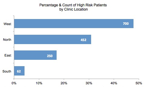
By displaying this same data in a bar chart, I can easily rank the data, and with very little effort I can understand how many more high-risk patients the West Clinic is managing then the North, East, and South Clinics. I can also see the number of patients at each site because these figures are included right in the bar, and I don’t have to use a lot of different colors to differentiate between clinics. This chart is simple, clear, and easy to understand and act upon.
After all these years of writing by data visualization experts like Tufte and Few, and the opportunity to hear numerous lectures and presentations about the most basic principles and best practices of data display, it is interesting to ponder why software vendors continue to include doughnut chart functionality in their applications and why people continue to use them. In any case, you now know better: like love, a bar chart is all you need. Save the doughnuts for dunking.


0 Comments