I recently heard about a study that found that people who read and study nutritional food labels weigh, on average, about nine pounds less than people who don’t. Suffice it to say that I have purchased an extra set of reading glasses to take with me to the grocery store from now on (so much easier than an early-morning run).
When you stop and think about it, the results of this study really aren’t all that surprising. We know that information has the power to help us make better decisions, and thereby to help us change and improve the way we navigate our world. The challenge lies in communicating this knowledge so that it is clear and useful, and leads to fully informed (thus better) decisions.
The current Nutrition Facts label familiar to most of us was first designed in the early 1990’s in compliance with the U.S. Nutrition Labeling and Education Act (NLEA). The food ingredient panel lists the serving size as well as the calories, percentage of the Minimum Daily Requirement (MDR) of various vitamins, and substances present in one serving, as in the following example I found at the U.S. Food and Drug Administration website.
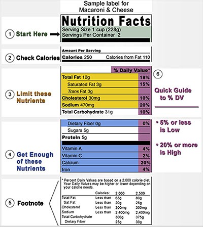
These labels offer loads of information, much of it useful. What they don’t do is tell people whether something is really beneficial — in every sense of the word. With a different set of criteria and some clear graphics, food packages could tell us a lot more, a lot faster.
Enter the University of California Berkeley’s School of Journalism and a contest called Rethink the Food Label. Designers were told they could either incorporate the nutrition label’s existing breakdown of fats, sugars, vitamins, calorie counts, and percent of daily values; or re-imagine the label to include geography, food quality, food justice, carbon footprint, and|or lesser-known chemosensory characteristics. (Chemo-what characteristics, you ask? I believe this means chemical additives, but let me know if you have a better interpretation).
The sponsors of the contest sought informative, instructive, clear, and memorable designs with the potential to inspire better food and nutrition literacy. (I personally want that magic label that guarantees that I will weigh 9 pound less if I simply read it.)
The winning entry was created by San Francisco designer Renee Walker. Here’s an example of her creative work:
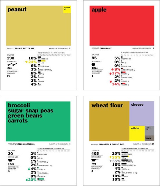
Her re-design shows the proportion of each ingredient in the food product, using simple, clear graphics to impart information. For example, in the apple label above, the box, or tree map (a visual representation of the ingredients in the food) is completely red, meaning that when you eat an apple, you are getting 100% apple. In contrast, the macaroni and cheese visual (bottom right) of ingredients shows that when you eat mac and cheese, you’re eating mostly wheat, cheese, a small amount of milk, and some additives and preservatives.
The serving size and calories are also easy to find and read in Walker’s design. Calorie counts are displayed in large numbers, prominently positioned, and close to a symbol representative of the food’s serving size. For example, in the peanut butter label we can clearly see that there are 190 calories in two tablespoons (one serving) of peanut butter.
I especially like the scale that shows the percent of daily value a food represents in proportion to a 2,000 calorie diet — a concept that I have always struggled to grasp from its portrayal on current food labels. In Walker’s re-design — scale at the top, bar graphs and accompanying percentages below — I now find it quite easy to understand the idea. The addition of the thumb turned up, down, or sideways adds a dimension of information about how beneficial these ingredients may or may not be for me. Looks like I should consider eating less mac and cheese, and more apples and broccoli. Damn these labels.
A few things may need to be worked out with Walker’s design or something like it before the new labels are ready for prime time. For example, I was a bit confused and distracted when I first read the word “carrots” in a list of green vegetables displayed in a green box; and I am a little unsure about what data is being encoded in the two colors on some of the bar graphs. Overall, though, I heartily applaud these re-designed labels. Now I only hope that someone at the NLEA has been made aware of this contest and of Ms. Walker’s clever, creative, useful winning entry.


0 Comments