Dr. Fizzy McFizz at DocCartoon.com has identified the seven types of physician handwriting she encountered during her medical training. I’m not a physician, but—I’m embarrassed to admit—my handwriting fits squarely into category #7: “Had 30 Seconds to Write.” I disclose this personal failing with apologies to the nuns who taught me the Palmer method of penmanship. Dear sisters, please pray that I find salvation by promising to type all future communications.
Here’s Dr. McFizzy’s chart:
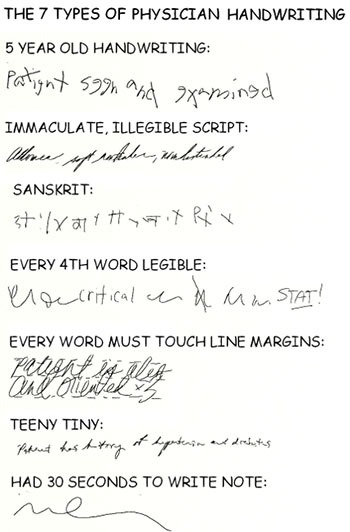
Okay, so this is an old, familiar joke: physicians have been long derided for their lousy handwriting (which often requires an advanced degree in cryptology to decipher); but it’s also a very sobering joke. Here’s why.
Numerous solid scientific studies and papers cite the real dangers of indecipherable handwriting: poor patient care and medical errors, just for starters. A paper published in the British Medical Journal (BMJ) reports that an American cardiologist caused the death of a 42-year-old patient when his prescription of 20 mg. Isordil, an anti-anginal drug, was misread by the pharmacist as 20 mg. Plendil, an anti-hypertensive drug (BMJ 1999;319: 1456). Death is certainly the most dreadful outcome of illegible handwriting by physicians—but it’s certainly not the only adverse one. Unreadable handwriting can also lead to unnecessary tests and inappropriate or delayed treatments, which can result in unnecessary pain and suffering, or even long-term disability. From any angle, it’s something you don’t want to see or have to work with—a bad trip all around.
And as bad handwriting by docs can lead to horrible mistakes—sometimes even fatal ones—bad “report” handwriting, by which I mean the fonts you use in your healthcare data reports, can lead to poorly communicated information.
Consider the following examples from Nancy Duarte’s book Slide:ology: The Art and Science of Creating Great Design:
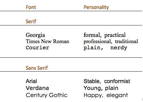
Each of these fonts has a personality and characteristics that make it the best choice for a particular type of communication. For example, fonts with serifs are intended for a long sequence of words that exceeds one line. The serifs (embellishments that look like little feet attached at a 45- or 90-degree angle to the upright lines of the font) link the letters one to the next, so that they appear connected. The tiny serifs guide the reader’s eye along each line, helping it stay on the correct line of text in very dense copy. A serif font would be a good choice for a tome like War and Peace or the Federal Tax Code—and even works well in shorter texts, like this one.
Conversely, “sans serif” fonts (sans means “without” in French) lack the little feet, and the letterforms are bigger and bolder—simpler, easier to take in at a glance. They are as a result often used in children’s books, in headlines, and on signage, and are usually a good choice for labels and titles on graphs and charts, or for data displayed in a table. (I almost always use Arial, one of the oldest and most widely recognized sans-serif fonts, in my data displays for this very reason.)
The width assigned to different typefaces is another important characteristic to consider when choosing a font. Some typefaces assign different (varying) widths to each letter or character based on its shape and size—an “l” is allowed less space than a “w,” for example. This type of font is referred to as a “proportional” or “proportional spacing” font. Other faces allow each character and letter the same space. For instance, typefaces such as the Courier and Lucida Console families assign an equal width to each letter and character, which can make words harder to read in a block of text. On the other hand, it is exactly because of this equal spacing that such monospaced fonts are excellent choices for ensuring that lists, columns, and tables of numbers display in precise alignment.
My cherished Arial, by the way, is an interesting hybrid in this category. It’s a sans-serif font, which makes it cleaner, clearer, and faster to read from far away (on signs, for example, or on a chart); but its letters are also proportionally spaced, which makes words printed in Arial easier to read in multi-line passages. However, numbers in this versatile font are in essence monospaced—assigned equal room no matter how fat or skinny they are—making them sharp, consistent, and neat for lining up in columns of figures, budget totals, and medical statistics!
Consider the following table of numbers with data displayed in fonts of varying width assignments and—for added impact (or clutter)—with serif and sans-serif fonts:
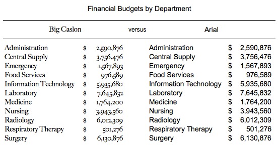
With its extra flourishes and slightly old-fashioned (if beautiful) look, the text in Big Caslon is much harder to read than are the columns in Arial, and the Big Caslon numbers are (in technical terms) Non-Lining Numerals versus Lining Numerals. The viewer has to work extra hard to see and understand the data when a Big Caslon font is used.
Your safest bet is to choose one font per document and stick with it—especially for tables of numbers like the one above. As you might guess, I recommend Arial for this task: it’s a clear, familiar sans-serif font, and assigns the same width to each number, so that your data will always be aligned. Remember: your job is to communicate in a way that people will understand quickly and easily. Fancy is nice when choosing a restaurant or a sports car; simple and plain are better when communicating data.


0 Comments