Hey, guess what I did last week? My husband and I finally realized our dream of owning a boat. We even named it Visualize — for all the reasons you might imagine. Yes, I can hear you all chuckling from way over here on deck, reminding me that the two happiest days of a boat owner’s life are the day she buys the boat and the day she sells it (and I’m laughing with you).
Here is what I love most about having Visualize: I get to see lots of familiar things in new ways. I have been acting like a teenager who just got a learner’s permit, and thinks the family station wagon is a shiny, sexy race-car. (Who needs a yacht, anyway?) I’m having so much fun slowly (very slowly) motoring around Boston Harbor, seeing my city from a fresh perspective: the JFK Library lit up at night, the islands where forts were built to protect the coast, the Boston Harbor Light…It’s so cool and inspiring to consider it all from a different point of view. (Getting the boat back into the slip on a windy day is not so much fun — but we are working on visualizing the right way to do that as well.)
Being out on Visualize also made me realize that something I use and work on all the time can benefit from a “fresh tack” (a nautical expression meaning “a new direction”) — Gantt Charts (you knew it was coming, right?), for instance. Most of us are familiar with these charts, which are most often used for tracking schedules and displaying information about the tasks involved in, or the phases of, a project.
The following is a simple Gantt Chart created in Excel to help people build and assign a timeline and tasks associated with researching, creating, and presenting a report.
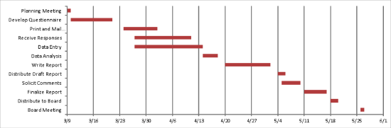
The X axis displays tasks; the Y axis shows when work on them must begin and end to ensure that the report is ready in time for the final deadline, a board meeting.
Now let’s get creative about using a chart like this to display a different type of information — utilization of CT scanners. Instead of comparing different tasks, we want to compare how multiple iterations of the same resource (the scanners) are being used, in order to identify opportunities to configure them differently and improve efficiency.
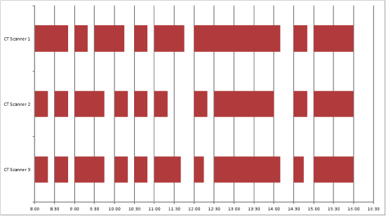
Instead of listing tasks, we listed every scanner along the Y-axis. Just as on the first chart, above, we display time on the X-axis; in this case, standard appointments for scans, at thirty-minute intervals. Next we encode the actual length of time that each scan required, and display that information as bars in the chart. This arrangement makes it very clear that CT Scanner 2 had unused time from a little after 11:00 am until noon, and that all scanners were idle after 4:00 PM, even though there were still appointment times available. By displaying CT use this way, we can quickly and easily clarify what we don’t know about this schedule, and ask specific, useful questions to guide our investigation, uncover gaps and inefficiencies, and craft improvements.
A final example uses Tableau to display operating room use.
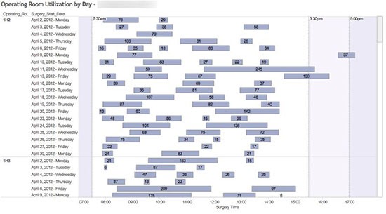
In this example, we have listed each operating room and the days of the week it was fully staffed on the X axis, and regular time intervals on the Y axis. We also added three vertical lines to show operating room opening (7:30 AM) and closing (3:30 and 5:00 PM) times. The addition of these vertical lines makes it easy to see where procedures started on time, started late, and|or ran late, and helps us to identify cases that may need further inquiry. (We also encoded actual surgical case minutes in each bar.) The white space (unused time, where an OR was idle) used here packs a visual punch, crying out as no narrative or table could for further investigation. Displaying the data this way reveals — clearly, rapidly, definitively — the central truth: while a lot of surgery is getting done, OR time is still being wasted, as individual theaters are not being used to capacity.
My experience putting Gantt charts to work for new, different types of data display shows how easy it is to use familiar tools in fresh, innovative ways. What about you? What data visualization tools have served you in unusual ways? Send me a note and let me know-maybe we’ll feature you in our next newsletter! Or what about a contest, with first prize a leisurely harbor cruise on the new boat? Just Visualize that!


3 Comments
Mark Holtz · May 16, 2014 at 2:32 pm
Is there a tutorial on how you built the Tableau view? I have a requirement to literally build the EXACT same chart–it is for Anesthesia, but it is will show OR utilization the same way you have done. I am decent with Tableau, but this is my first foray into the world of Gantts.
-Mark
Raj J. · February 1, 2018 at 1:32 pm
Mark,
I would also love to see how the Tableau view was built. Did you have any luck with this?
Thanks,
Raj
Sandra Lawson · February 1, 2018 at 2:14 pm
Hi Raj,
Thanks for loving the viz we built. We have instructions for how to build out this view in our book Tableau for Healthcare, third edition available on Amazon. You can download the data from our website, follow the instructions and presto chango you are an expert at developing a modified gannt chart with operating room data. Hope this helps.