Every August for the past 30 years, we have vacationed on Bustins Island in Casco Bay, Maine (check out my September 2011 newsletter about this slice of paradise). You can get to the island only by boat; for us, this has meant fighting summer traffic desperately trying to catch the island ferry, which runs on a tight schedule and waits for no one. The result has been a fair number of nerves frayed and unprintable expletives shouted at those impeding our progress. (“We need to catch a boat, people!”)
This year, however, promises to be different: finally, after many long years of dreaming about it, we now have our own boat, which we plan to pilot from Boston to the island. I am cautiously optimistic that it’ll all go swimmingly (perhaps swimmingly is a bad term — but you get the general idea) and we’ll have another fabulous vacation.
Our new mode of travel has generated a fair amount of discussion and planning, as we are new to the world of boating (translation: we don’t know anything about it). How long will the trip take? How much gas do we need; where can we get it; and — my most pressing question — will I be able to see land the entire way?
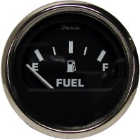
The whole gas question has been a tad problematic: unlike the gas gauge on our car, which tells us when we are low on gas as well as how many more miles we can travel before the tank is empty, the gauge on the boat offers very limited information. In fact, the boat gauge appears to show only two values: completely full and completely empty. (The gauge doesn’t seem to be broken; it just has a bit of an attitude.) It is so hard to figure out how much gas is in the tank that my husband, Bret, has resorted to a paper log to track our gas consumption.
It occurred to me the other day that this gauge is about as helpful as gauges on healthcare reports and dashboards — that is, not at all.
Here’s what I mean. When you create reports and dashboards, you need to provide as much and as clear information as possible, to help people make informed decisions. They need to see trends or changes in values along with comparison data; and they need to see as much of that information as possible on the same page or screen.
Now let’s think about how well gauges meet these requirements using the following example.
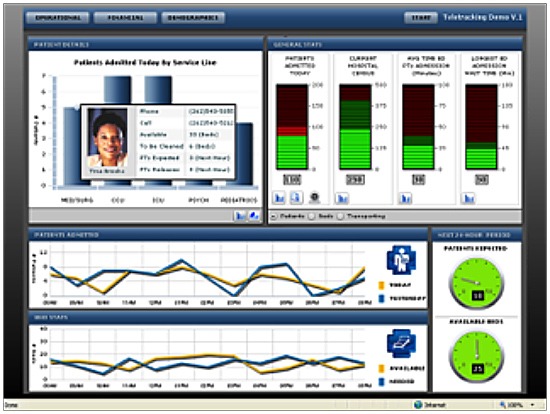
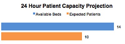
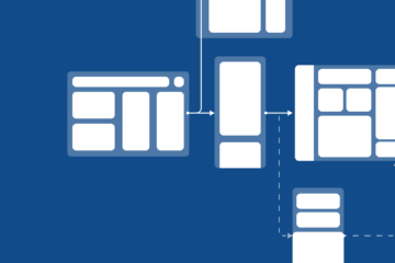
1. Comparison Values — There is no easy way, using a gauge, to compare one value to another. In the dashboard above, the authors have resorted to using two gauges to display (a) the number of patients a facility can expect in the next 24 hours and (b) the number of beds available. These values could be more effectively and directly displayed using bars, like this:
2. Trends — Gauges don’t allow your report viewers to see trends over time. In the dashboard above, a line graph is used to show the hourly trend of available beds and patients (this in addition to the two gauges displaying expected demand in the next 24 hours). Combining everything into one line graph, however, would show this crucial information — the projected numbers of beds and patients — with clarity, efficiency, and order, like this:
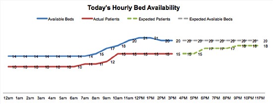
Thanks to this clear, simple display, we can immediately grasp four pieces of trended information: actual beds and patients, and expected beds and patients. The gauge displays only one expected value for a full 24-hour period.
3. Real Estate — As shown above, a bar chart or a line graph can pack a lot more information into far less space.
There are a few other terrific tools that you can use instead of a gauge, such as a bullet graph (read about them in my April 2012 newsletter) and sparklines — both convey far more data and information than a gauge ever could, and both are perfectly designed for use in a dashboard.
By now, Bret and I know that we really love our boat — and really hate its gas gauge. We hate it because it’s not reliable or helpful: it doesn’t inspire confidence in us by providing clear, accurate, well-displayed information about the important decisions we need to make. I truly dislike gauges on reports and dashboards for exactly the same reason: they don’t provide information to the extent or in the ways required for confident, correct decisions.
And don’t tell me they look cool. In either case, I don’t care what they look like. If I’m drifting into dangerous, shark-infested waters, cool-looking gauges are the very last thing I need. (Yes, Jaws fans, I know: I’m “gonna need a bigger boat.” And possibly a bigger gas tank, too.)


3 Comments
Alain Girard · August 13, 2013 at 10:59 am
I am totally convinced that bullet graph are far superior than gauges to display data on dashboard. The problem I am facing with Business Intelligence tool is that many of them incorparate basic graphs capability; no bullet graphs, no box graphs, limited scatter plot graph.
Since we have Oracle database in the hospital where I work, we use:
– Oracle Business Intelligence Publisher
– Oracle Business Intelligence Enterprise Edition (OBIEE)
But those 2 solutions do not meet all my expectations when it comes to producing effective graphs.
Do you have any advices regarding the best software solution we could use?
Thanks
Data Viz News [18] | Visual Loop · August 3, 2013 at 9:49 am
[…] 3 (Really Good) Reasons Not to Use Gauges | Katherine Rowell & Associates […]
Data Viz News [18] · August 4, 2013 at 12:38 am
[…] 3 (Really Good) Reasons Not to Use Gauges | Katherine Rowell & Associates […]