I recently got to glimpse what a jet-setter’s life might be like when I went to Niagara Falls, Canada, for less than a day (in and out in about eight hours) to deliver a keynote address to a very nice group of Canadian epidemiologists. Granted, I flew coach to Buffalo, New York, then caught a minivan tricked out as a cab to get to the meeting site — not exactly hopping a private jet for déjeuner à Paris — but it was sort of thrilling all the same.
I included in my presentation examples of data displayed in 3-D, and ran through a few of the reasons that you should avoid using it. (Get the full story in my November 4, 2011, newsletter.) When I returned to my office, I was pleasantly surprised to receive a very agreeable e-mail from one of the meeting participants describing a situation where 3-D display would, it seemed, be justified.
The figure below, the note explained, compares physical activity by women who are mothers and those who are not. When shown in only two dimensions, the graphic makes it look as if one bar — representing 17 minutes of activity per week — does not exist; but even that small amount is important information and needs to appear. In 3-D, the color shows; the information is communicated; perhaps action will be taken.
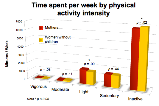
I understand the dilemma: people frequently ask me how to show vastly different values in a single chart or other display. I found the use of 3-D to address this rather thorny problem both interesting and creative.
Nevertheless, I think there are several other (better) ways to tackle this one. For scientific data displayed for science professionals, a logarithmic scale works very well. (For the general public, as in the present case, perhaps not so much.) A panel chart, where small values are shown in one display and large in another, might also be very effective.
For this rather complex presentation of physical activity, however, I believe a broken-axis will do the trick. Although it is a bit cumbersome to create (and not ideal where data change and are regularly updated), it can be a good option for a one-time display such as this poster, and is pretty easy for a general viewer to grasp.
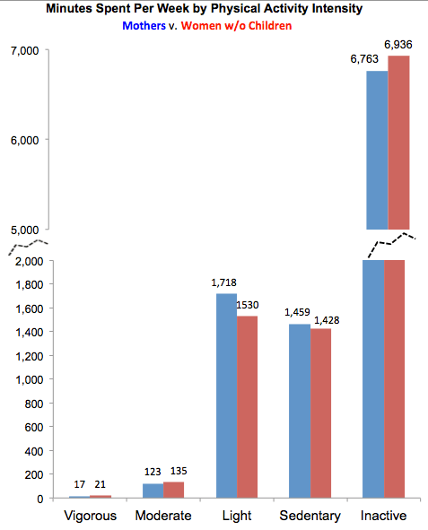
A broken-Y axis format helps us see and, with luck, act on the rather startling jumps in values displayed here. The first category, “Vigorous,” shows very few minutes of activity (17 for mothers, 21 for women without children). “Moderate” increases to about 123 and 135 minutes respectively; for “Light” and “Sedentary,” the values climb to around 1,500-1,700 for both groups.
Then the totals take a huge jump: in the last category, “Inactive,” both groups of women report averaging about 7,000 minutes per week — which even for a self-proclaimed slug is pretty alarming. To highlight this striking change, we’ve broken the scale of the Y axis into two increments, enabling us to show the wide range of values in an interrupted but clearly continuous scale. Now we can compare tiny values and much larger ones in a logical manner. Further, the addition of labels on each bar makes clear the call to action-for women to be more physically active.
(Note that the original display shows p-values on the graph. These should probably be included in the narrative or the table of data instead of directly on the display graphic.)
I have to admit that I was pretty stunned by these data, and I agree that showing the problem as completely as possible — which a broken-Y axis display can do — is crucial.
On a different but related note: now that I am traveling so much, perhaps I’ll start to graph my hours en route. Since I am alas no jet-setter, I am going to need a lot of broken axes to account for tortured hours waiting for connecting, missed, and cancelled flights. A lot.


0 Comments