Sadly, the long, lazy afternoons making and sipping my favorite summer cocktail — a watermelon mojito — are winding down. I love this drink, made with fresh watermelon purée, mint, lime juice, simple syrup, and light rum. The layering of flavors is nothing short of mind-blowing. Each sip unfolds on your taste buds in a surprising experience of icy-cold-sweet, then a bite of sour, then a finish of smooth, soothing rum. Just when you think you have tasted it all, it hits you with one more flavor or sensation that causes you to break into a chorus of hallelujahs and James Brown dance moves (for real).
And although summer days and watermelon mojitos are both mighty fine and complex on their own, as with so many things in life (peanut butter and jelly, peanut butter and chocolate, peanut butter and bananas — you get the idea), it is the two things paired that makes for a truly sublime experience.
It may seem self-evident that combining elements can often improve our overall experience. In order to find these combinations, though, we have to first be open to exploring them. Great chefs know this about ingredients; great writers know it about words; we need to know it when it comes to presenting our healthcare data. Here’s what I mean.
Recently I’ve had several inquiries from folks who are struggling to find effective ways to communicate important healthcare data. Here as well, the solution is in combining elements.
People often create reports that use only graphs or only tables; but sometimes teaming display media — tables, graphs, figures, words — is the best way to convey the story in your data in a clear and compelling manner. Consider the following data-display combinations:
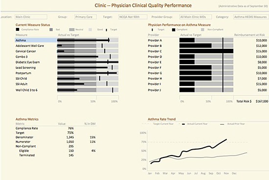
In this example, a combination of graphs, figures, and a table was used to show physicians’ clinical performance (all data is example only, not actual). The asthma bar chart highlighted in blue on the upper left is the measure we want to explore further; its presentation signals that all information displayed on this report is specific to asthma.
The performance of individual MDs on asthma compared to target goals is displayed in a bar chart; at the end of each bar is a figure showing reimbursement | dollars at risk if the physician fails to meet that target. At the lower left is a table of summary information about the underlying data; to the right of that is a line graph displaying how all of the MDs’ collective performance on the asthma measure is trending over time.
Here the graphs show us quickly and easily how physicians are performing overall; in comparison to target; and stacked up against one another. By adding the dollars-at-risk figure, the report drives home, clearly and precisely, why hitting the target is crucial for the group’s finances.
Here’s another report that we created (in Tableau) combining graphs, tables, and figures. At the top is a table of values about operating room use at different hospital campuses (we have blurred the campus names in this example), followed by a series of graphs that displays the same information by specific surgical departments.
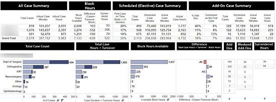
By combining a table and a graph, we can display precise values about operating room time (by campus) in the top quadrant. With graphs in the lower section, we can quickly show, in ranked order, the underlying detail of the same information categorized by surgical department. The bar graphs display each department’s case volume along with available and used block time. We added values at the end of each bar graph to show specific information about numbers of add-on (urgent|emergent) cases handled during the week and on the weekend, and how many hours of block time the department surrendered. We displayed these values in tables because (although they are important) they are not the primary focus of this report; OR block utilization is.
As demonstrated in these two examples, combining display techniques can often be much more revelatory than using a single approach. However, as so often in life, using a powerful tool is both easier and more effective if you are thoughtful, and take a bit of time to plan your design.
Here are some tips for choosing and using the best tools for each task.
- When to use a table.
Use a table to show the precise values your viewers will be most interested in knowing, and that help complete your message by adding a powerful punch about the importance of a specific metric.
- When to use a graph.
Use a graph when you want to quickly and easily show comparison, ranked, and|or trended data. This will make it easy for your audience to grasp the message in the stats.
- Figures and narratives.
Is there a simple sentence or one additional figure or value that will complete the story? Go ahead and add it!
- Edit, enhance, refine.
Please remember: no report or dashboard is perfect on the first go-round. Play around with it; test it on people — and I mean really test it: ask people specific questions and listen carefully to what their replies can and can’t tell you about the data in the report. See what questions your design elicits. Editing is part of the work — embrace it!
Any great recipe is the result of experimenting until the exact right balance of flavors, textures, and aromas emerges. Fortunately, “experimenting” includes lots and lots of tasting (and testing), which leads to enhancements and refinements. I am certain that there were a fair number of very happy taste-testers working on watermelon mojitos as they were being perfected.
Hey, wait a minute! Where was I when that was happening? Was there a memo?


0 Comments