I had the flu last week, and it sucked. Well, except for two things: first, I got to lie on the couch for days on end. Second, no one battled me for the remote control. The first couple of days, the most I could focus on was the weather channel (to say I was pathetic would be generous). As I felt better, I upgraded to re-runs of Law and Order, and when I was just about back to feeling like myself, I managed to take in a very interesting and wildly frightening episode of the PBS news show Frontline entitled “Hunting the Nightmare Bacteria.”
Let me sum up the message of the show for you: bacteria are getting smarter and meaner, and many are resistant to our current arsenal of antibiotics. The data are so alarming that the World Health Organization warned last year that a post-antibiotic era means, in effect, an end to modern medicine as we know it. Suffice it to say that I am now scared enough to pay very close attention to this issue. (You should, too.)
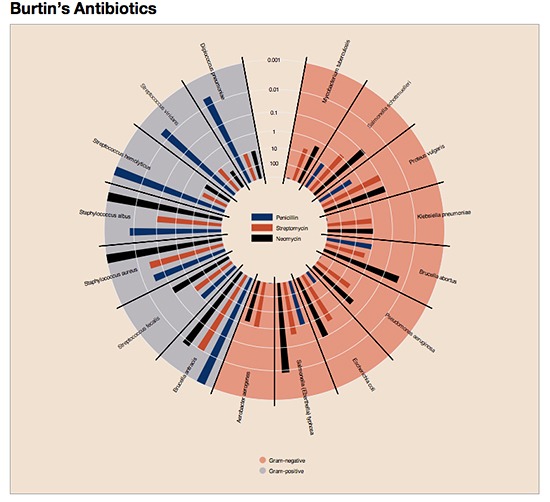
Becoming newly enlightened about this very real and present danger sent me searching my bookshelves to find Will Burtin’s famous diagram-the one that compares the effects of penicillin, Streptomycin, and Neomycin on a range of bacteria. (Will Burtin, 1908-1972, the German graphic designer, educator, and theorist, is considered one of the foremost information-designers of the twentieth century. In addition to establishing his own firm, he wrote and designed for Scope, Upjohn Pharmaceuticals’ journal for physicians. See more of his work by clicking here.)
In the post-World War II era during which Burtin produced much of the work for which he is best known, antibiotics were called “wonder drugs,” because they provided quick and easy cures for what had previously been intractable diseases. Data were being gathered to promote understanding about which drugs worked best for which bacterial infections; as you can imagine, being able to see the structure of drug performance was a huge help to clinicians and researchers alike. In the fall of 1951, Burtin published the following graph, which displayed the effects of the three most popular antibiotics on 16 different types of bacteria.
Source: Protovis
Burtin graphed the concentrations (in milligrams/deciliter.mg/dl) of the antibiotics required to halt the growth of bacteria in vitro. Gram-positive bacteria stain dark blue or violet; Gram-negative bacteria do not respond this way. (In brief, Gram-staining reveals the differences between two types of bacteria that generate similar clinical symptoms, such as Streptococcus pneumonia and Klebsiella pneumonia.) Burtin’s graph indicates Gram-negative bacteria by shading the outer circles red, the Gram-positive bacteria with blue.
Next, the effectiveness of the antibiotics is expressed as the highest dilution in mg/dl that inhibits the test organism. High concentrations are near the center, lower concentrations are further out, making the length of the colored bar proportional to the effectiveness of the antibiotic for a specific bacteria. So, for example, at the top of the chart in the blue Gram-positive section for Diplococcus pneumonia, high concentrations of Streptomycin (11 mg/dl) and Neomycin (10 mg/dl) are effective in halting the growth of bacteria versus a much lower dose (0.005 mg/dl) of penicillin. Wow, man!
As interesting as this chart is to look at, it requires a lot of work to figure out. And if you think about it for a minute, it’s really sort of a great big, jazzed up, pie chart-unique in design, but ineffective at making the information easy to grasp quickly and surely.
Now consider the following redesign, an entry submitted by Justin Talbot, a Ph.D. candidate in Computer Science at Stanford University, to a contest in Chance magazine.
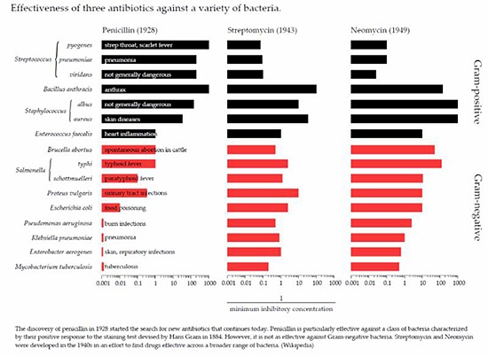
Justin used the x-axis to label the bacteria of interest, and has also included a bit more information about diseases and illnesses (ones we all can recognize, such as pneumonia and food-poisoning) caused by them. (This part is a bit crowded, but the idea is pretty good.) By orienting the data this way,
Talbot helps us clearly see the threedifferent types of antibiotics and when they were each discovered; the length of each bar makes it easy to understand the amount required to effectively inhibit each bacteria type. Justin also colored the bars in the top half of the graph black for Gram-positive and at the bottom in red for Gram-negative bacteria, making it fast and simple to differentiate between the two types.
No one can dispute Burtin’s leadership in the field of information visualization, and I love looking at his work. Here, though, I find Talbot’s simple display of the data much easier to understand-and after all, isn’t clear, fast, effortless understanding our prime goal?
Well, what started out as a lousy bout of the flu resulted in heightened awareness of the real and serious problems our world faces due to antibiotic-resistant bacteria. It also caused me to dig out Will Burtin’s antibiotic graph, and to both re-connect with his pioneering information-visualization work, and find and consider new, different, and perhaps more effective approaches to displaying that same data more than half a century later.
All in all, not a total “flu bust” by any means!


0 Comments