These days, whenever I deliver a talk or lead a workshop, someone almost always asks, “what’s an ‘infographic’ anyway?” I find this question intriguing in that it reflects what seems a growing awareness of the different ways of communicating healthcare data and information, as well as the confusion that some of those methods cause.
So — what is an infographic?
In Visual Language, Robert Horn defined “infographics” (a merged form of “information graphics”) as:
Moderately sized, meaningful combinations of words, images, and shapes that together constitute a complete communication unit. Visual and verbal elements are tightly integrated. [Each i]s as self-contained as possible on 1 or 2 pages or on a large screen. Usually contains more information than a concept diagram, although an information graphic may use any of the types of concept diagrams as its central visual element. Usually contains several blocks of text.
Robert E. Horn, Visual Language. MacroVU, Inc. (Bainbridge Island WA, 1998), 61.
This technical description of the structure is a start, but it doesn’t answer the key question — “why?” Why create infographics? What purposes can and should they serve?
First, an infographic has to inform the viewer; it must combine words and pictures to communicate a particular message. That message must move the viewer to a desired outcome: learning something new about an issue, being persuaded to a point of view, or (the Holy Grail) taking action.
What makes a good infographic — one that attracts, informs, and inspires all who see it? In their book Infographics, The Power of Visual Storytelling, Lankow, Ritchie and Crooks refer to the Roman architect Vitruvius’s principles of good design as measures of what make for good infographics. They highlight three of particular importance:
- Utility. Infographics must be objectives-based. Success is measured by how well the design enables its creator to achieve a desired objective.
- Soundness. Good infographics communicate something substantial and engaging. If no one cares what is being conveyed, the design has failed. Successful infographics deliver a compelling message worthy of attention.
- Beauty. Of course, the format and design quality of an infographic are crucial. Illustrations must support the story the data tell, and the quality of those data must be high.
I would add an additional key component for creating great infographics: a designer and design team who understand the data and information to be displayed. I can always tell when a designer doesn’t know much about the subject at hand: the story isn’t clear, and I am neither enlightened nor compelled to act.
The following is a static (the information conveyed is fixed) infographic about the deadly epidemic of prescription drug abuse in the U.S.; we created it with our design partners, Peter Massarelli and Jim Leightheiser at Breviloquent. We chose this public health issue because it’s squarely in our area of expertise, and the data are so breathtaking that we felt compelled to make people aware of them.
 Click here to view full infographic
Kudos to Peter for what I think is a brilliant and provocative first visual — a gun firing a bottle of prescription drugs. The image reinforces the message directly below it, that prescription-drug abuse is a rapidly growing and deadly epidemic. The overall feeling is dark, like that of a film noir movie poster, setting the tone of something serious, deadly, and insidiously destructive.
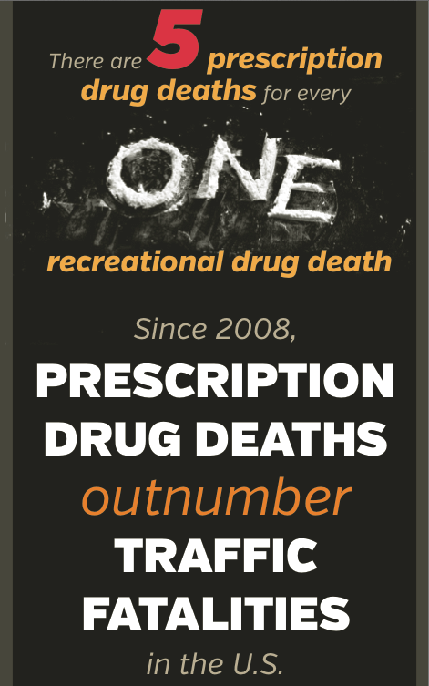
Jumping to a later section in the infographic, we see information about the number of prescription drug deaths as compared to recreational drug deaths. A nod here to my colleague (and Best Boring Book co-author) Ann Cutrell for the suggestion that we design a provocative visual to reinforce the difference between the number of prescription versus recreational drug deaths, and to Peter for the illustration of the number of recreational drug deaths in lines of cocaine. Again, the illustration powerfully and memorably reinforces the message.
 Click here to view full infographic
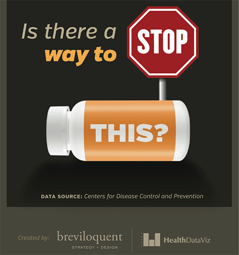
At the bottom of the design, we ask, “Is there a way to stop this?” We tossed around the idea of offering possible ways to take action, but because we had decided early on to focus on raising awareness and educating people about this issue, we decided to simply raise a question without concrete suggestions for further response.
 Click here to view full infographic
Whether you have already created infographics for your organization or are just considering the possibility, remember that it is important to first establish the goals of your display, and to select the data and information you will use.
Next, experiment and then experiment some more, looking for a visualization that lets you see and understand data and information in a new and compelling way, one that attracts, informs, and inspires those who encounter it.


0 Comments