It’s that time of year again when we make our annual trek to Bustins Island, Maine, and jockey for nap-time in the oh-so-heavenly hammock (you can read more about the island in my September 9, 2011, post). This summer we decided to be a bit more ambitious (marginally so, mind you) and spend a few days harbor-hopping in our aptly named boat, “Visualize.”
We saw seals and porpoises and a 162-yacht (okay, not really in keeping with the nature theme, but pretty impressive all the same) and lobster buoys…lots and lots of different, brightly-colored lobster buoys. As a matter of fact, in some places there were so many buoys that it was like an ocean slalom course, making me wonder, “Can there really be that many lobsters? What exactly are the colors on the buoys all about? How does the system work?” And that in turn got me thinking about (you guessed it) the use of colors in our healthcare reports and dashboards.
First, a quick lesson on lobster buoys.
Buoys mark the area where lobster-men (and women) place their traps. Every lobsterman has a unique color scheme for his or her buoys and no two lobstermen are permitted to have the same buoy markings in the same state. Even before learning this detail, I did have a good sense that the various colors on the buoys were used to differentiate traps and signify ownership; what I didn’t know was that buoys are also labeled with state-registered license numbers like the six-digit one on the left in the photo below.

The numbers add another bit of identification; but it is the age-old use of color that enables lobsterers to quickly and easily identify their traps for harvest. An admirably simple and clever system (unless one happens to be a lobster, of course).

I have written more than once on the use of color to encode meaning and to grab a viewer’s attention (see, for example, the issues of February 10, 2012 and April 27, 2012). Today, inspired by the sheer number of different colored buoys we saw, I’ve decided to write about three particular attributes of color — hue, saturation and lightness (HSL) — and how we can use the second and third more effectively in our healthcare reports and dashboards.
- Hue is the technical term for what we usually refer to simply as color (the primary colors red, blue, and yellow, for example).
- Saturation refers to the dominance of hue in the color.
- Lightness (sometimes referred to as brightness or value) measures the degree to which a color appears dark or light, ranging from fully black to fully white.
The following diagram shows how the hue of red may be changed by the addition or subtraction of lightness.
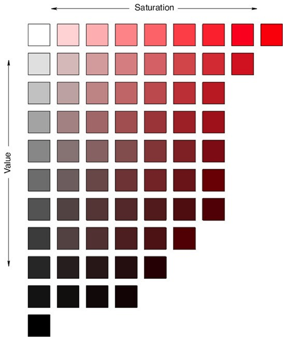
Source: North Carolina State University
Thanks to the work of researchers in the field such as Colin Ware (Information Visualization: Perception for Design, 2000, 165 and 166), we know that color, and the hue and intensity of color, may be used to leverage our pre-attentive processing — that is, the discovery of a limited set of visual properties detected very rapidly and accurately by our low-level visual system. Take a look at the following two sets of dots to experience this first-hand:
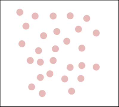
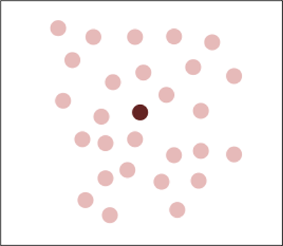
You can see that by simply changing the color saturation and darkening the red hue it is easy to immediately draw a viewer’s attention to the red dot in the middle of the second box — to leverage pre-attentive processing and thereby firmly direct where a person looks first.
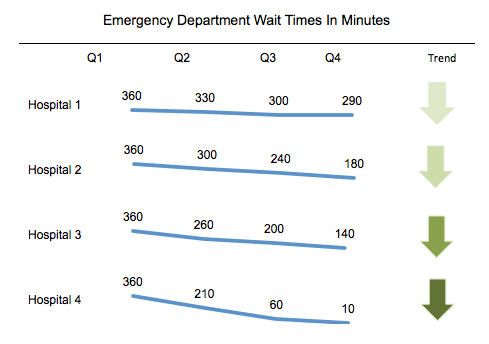
Now consider the following example of four different Emergency Department waiting times, where I have used progressive amounts of color saturation and lightness or darkness inside of an arrow icon to indicate both the direction of a trend and information about the degree to which or rate at which the trends happen.
By use of a line graph punctuated by a directional icon that becomes darker as the rate of improvement increases or improves over time, the viewer can be shown that while all hospitals have improved, Hospital 4 has posted the greatest reduction in wait times. The dark green icon says, “Look at me first,” and that is where the eye is led.
While the last example is useful in explaining the three primary attributes of color and the concept of pre-attentive processing, I want to be clear all the same that we should always strive to keep things simple and free of unnecessary clutter. In the following example, the use of the dark red icon signals that the viewer should look at Hospital 1 first because its performance has hardly improved at all, followed by Hospital 2, which has shown some improvement, but is still not seeing patients in the ED quickly enough. Leaving off any indicators for Hospitals 2 and 3 where performance has radically improved and is within an acceptable range keeps the view clean and eliminates unnecessary distractions.
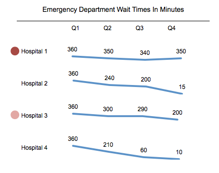
In this last example, we are signaling clearly, “Look here first: it’s where you need to take immediate action!”
I love our vacations in Maine — in part because it is so beautiful and relaxing, in part because I finally have the time to simply think and consider things I have been looking at for years and years in a new way. When I do, I am amazed at how many of the concepts I often use in my work are illustrated in the world around me as well.
Now, in the service of that perception, I’m going to go eat a lobster roll accompanied by a watermelon mojito while swinging in the hammock…


0 Comments