Have you ever packed and moved from one place to another? If so, you know the cold, hard truth:
- The textbooks and notes from freshman English are no longer of use to anyone.
- The spare parts to your long-abandoned childhood bicycle? You don’t need them.
- And that box marked “Miscellaneous,” which hasn’t been touched in over a decade, is full of uselessness. Full stop-don’t even go there.
You know what happens next, you begin the ruthless trashing and discarding of things. And if, as I did, you have a true moment of Zen-like clarity, the whisper in your head soon becomes a full-volume cathartic mantra that goes like this: “if the things in my life aren’t in current use in my life, then I don’t need or want them!”
The same rules apply in the design of reports and dashboards. With each data point to be included, I ask, and deeply consider, the key question: “Do I really want and need to include this data in this particular report? Does it add important context or clarity? Will people use it regularly, and if so, how?” As an example, here’s a situation I recently worked through with a client.
We were discussing how best to communicate the eligible patient population and associated results for clinical performance measures. As many of you are aware, the denominator for a performance measure is a specific patient population of interest (i.e., the scientific evidence supports screening or treatment as beneficial for the identified population). But from every population of interest there are exclusions. On the performance metric Screening Mammography, for example, the population of interest is women within a certain age range, but excluding (among others) women who have undergone either one bilateral mastectomy or two unilateral ones. My client’s performance reports, however, displayed both included and excluded patient counts, which led me to ask, “What can the users of your reports do with that information in the context of these performance metrics?”
Take a look at the following sample report with the excluded cases listed, and ask yourself the same question.
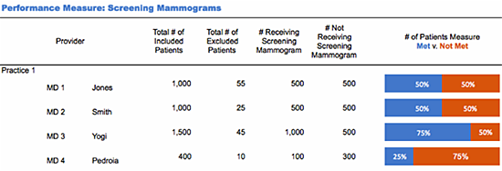
Can’t come up with a compelling reason to show patients from the excluded groups? Neither can I. Doing so would not only add no value; it would render the performance data (goals “met” vs. “not met”) harder to understand, as the viewer struggles fit that information into the overall picture. In significantly muddying the waters of comprehension, it could do even greater damage-by distracting from the real message: are women who are eligible for and would potentially benefit from screening mammograms receiving them?
Now look at the report with the exclusions removed:
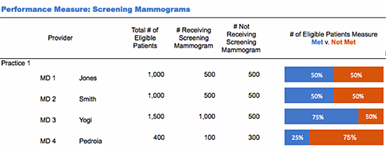
In this view, I have labeled the numerator “Total # of Eligible Patients,” and it is clear that the rates displayed in the horizontal bar graphs were calculated using this value and the two numerators “# Receiving Screening Mammograms” and “# Not Receiving Mammograms.” I don’t have to puzzle over how excluded cases figure into the calculations-because they don’t, so they aren’t there! And while it may be true that data on excluded cases has value, that is an entirely separate report.
Here’s the bottom line: don’t automatically include data in a report without first thinking through what it adds to the story you want to convey. Remember, you need answer only this simple question: “How will this information inform the decisions that the users of this report must make?”
And let me know if you need any used bicycle parts, OK?


0 Comments