Greetings from Bustins Island, Maine — where accomplishing as little as humanly possible is the only measure of a successful day.
To that end, I am a total overachiever at underachieving, and damn proud of it. So far this week, I have managed to reclaim the title of champion hammock-swinger and cocktail balancer, with a few obligatory westward strolls to watch the sunset and make certain my legs still work (they do).
It was during one of these strolls that my eight-year-old nephew, Aidan, and his younger cousin, Chase and I came upon the sign in the photo below, surrounded by flags and a few stones:
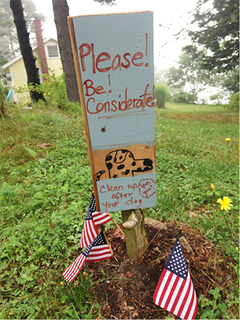
As soon as they saw this arrangement, the boys’ youthful imaginations took off. This, they explained to me in hushed tones, was where an islander’s beloved dog was buried. It had died in some tragic accident and most likely would come back as an island ghost dog. (I’m making the ghost part up, but you get the picture.)
Of course, I cracked up laughing, and then pricked their bubble by advising them to “Read the sign, you silly boys! There’s no dead dog under the sign — it’s simply a message reminding people to clean up after their pets.” My nephews now fondly refer to me as “Auntie Killjoy,” because their story was far more intriguing than the truth.
I’ve walked by this sign several times this week — which started me thinking about how looking at only the rocks, flags, and dog drawing in the arrangement caused the boys to jump to an (incorrect) conclusion. The accompanying (and central) message, communicated with words, on the other hand, made the real purpose of the display clear.
The same thing is true about the tables, graphs, and dashboards we create to display health and healthcare data: they can’t stand on their own.
Rather, they always require clear, concise titles and labels, and in some cases well defined, clarifying X- and Y-axes as well as the occasional pithy note to help viewers correctly interpret what they are seeing. Every display must be labeled directly and closely, thereby eliminating the need for viewers to spend their mental energy matching keys or lists of data to a display.
Here’s a simple example of how leaving out some basic information can really confuse a reader:
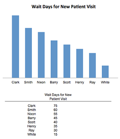
In this view, the bar chart makes it easy to see which person has the longest wait time for a new-patient visit — but it still leaves so much out. Are the providers physicians, nurse-practitioners, physical therapists, or some other group? What is the time-frame? Are the days listed the average? The median? With such patchy and incomplete information, it’s impossible to tell.
Now consider the use of just a few clarifying words in the title, and direct labeling of the bar chart:
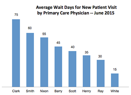
Thanks to the simple addition of “Average” and “Primary Care Physician,” along with the date of June 2015 and the addition of the number of days, the information in this display has been rendered 100% easier to comprehend.
Now, it’s easy to see that if a new patient called for an appointment in June to see Dr. Clark, [s]he would, on average, have to wait 75 days compared to 40 days for a new patient wishing to see Dr. Scott. Additionally, if I needed to include this chart on a dashboard, I have just freed up a whole lot of real estate by eliminating the data table.
These fixes might seem overly simplistic; but the display above is a real example of the kind I encounter regularly: with a bit of thought, such flawed displays can easily be improved.
Look at the entirety of the information you need to get across; then go over it carefully to see if you have condensed, combined, and labeled everything to convey as much and as meaningfully as possible.
Okay, I’m now losing the “how to be successful on Bustins Island in Maine” competition. I shall therefore return to my hammock to swing, and balance, and contemplate how very sweet island life can be.


0 Comments