I am writing this newsletter from my coach seat (28F, window) on United flight UA1292 from Boston to San Francisco. Funny how inspiration for a newsletter about healthcare data visualization and histogram bins can show up in the tightest spots.
This particular snug niche was the few cubic inches I desperately sought in an overhead bin, so I could stow my carry-on. As I did so, I was aggravated by the way luggage and other belongings had been shoved into places where it was clear they didn’t have a snowball’s chance in hell of fitting. Hello? If your things hang out of the bin and the door won’t shut, there’s a problem!
Then there’s the whole armrest fiasco. Is it mine, or is it the territory of the person next to me? Where does my boundary begin and his|hers end – when am I in the right space, and when have I illegally crossed the armrest border?
All of this got me thinking about the intervals, or “bins,” on histograms – the charts used to show the distribution of numerical data and to estimate the probability distribution of a continuous (quantitative) variable. Histograms are really useful, but – as with airplane bins – you need to be careful not to fall into “your bin or mine?” confusion.
A histogram is a type of graph most commonly used to show frequency distributions, or how often each different value in a set of data occurs. It looks much like a bar chart, but there are either no, or minimal, spaces between its bars, a feature which helps remind the viewer that the variables are continuous.
As a result, bins are usually specified as “consecutive, non-overlapping intervals” of a variable. The bins (intervals) must be adjacent, and are usually of equal size.
Histograms are very useful when you need to:
- Display the distribution of continuous data (ages, days, time, etc.).
- See if the data is distributed relatively evenly, is skewed (unbalanced), or is some other interesting shape as in some of the following examples:
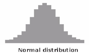
In a Normal Distribution, data tends to be around a central value with no bias left or right (often referred to as a bell curve because its shape is similar to that of a bell).
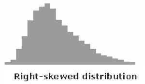
Skewed Distributions commonly have one tail of the distribution considerably longer or drawn out relative to the other. A “skewed right” distribution has a tail on the right side, a “skewed left” one, on the left. The above histogram shows a distribution skewed right.
Clearly, histograms are a great choice when you wish to display and communicate data distribution quickly and easily – but again, don’t fall into that “my bin or yours?” trap. Often I see data displayed in a histogram like this one, which I created using data from the National Vital Statistics Reports, v. 64, No. 1, January 15, 2015*:
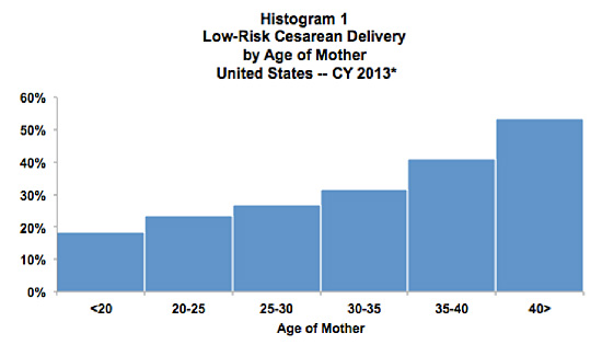
Histogram (1) displays the percentage of low-risk cesarean deliveries (C-Sections) by maternal age in the U.S. in 2013. Note that the X axis has divided maternal ages into bins; if you look closely, you’ll catch the “my bin or yours?” trap. If a woman is 30 years old when she has a C-Section, does she belong in the third bin (25-30 years) or the fourth (30-35)?
Once you catch this, it seems easy enough to fix.
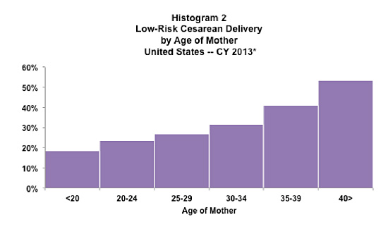
In histogram (2), I changed the bin labels to eliminate this overlap – but in doing so, I may have created a new problem. If the data captures the exact age of women (i.e., years and months), and a woman is 24.5, 29.7, or another “in between” age when she has a C-Section, which bin is she in? We might just make an assumption and move on, but there’s a better way.
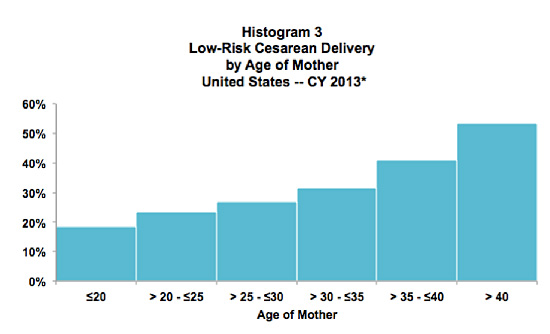
In the final histogram, (3), the addition of the “greater than,” “less than,” and “equal to” symbols provides the clarity we need to avoid the trap about where data with this level of detail falls in the distribution.
Now we can see that if a woman is age 24.5 when she has a C-Section, she is in the second bin; if 25.7, she is in the third one. Trap avoided: we have clearly labeled each five-year bin, thereby eliminating confusion.
The devil is always in the details, isn’t he? And yes, details matter if you are serious about making the story in your data (and bins!) clear, and if you want to avoid the “whose bin?” trap.
As for my personal bin and armrest struggles, flying first class may be the only solution.


0 Comments