It has been almost a month since my return to the States, following a truly gratifying professional engagement with the Canterbury Health District and Health Informatics New Zealand (HINZ).
If you’ve ever had the pleasure of traveling to New Zealand, you know all the accolades about it are true… true and oh so very, very true! The landscape is spectacular, the people are lovely and yes, of course, there are far more sheep in New Zealand than there are people. Lots and lots of sheep, like this darling little lamb at the Walter Peak High Country Farm in Queenstown (which, of course, they only let me hold after they had served me his brother for lunch – clearly a brilliant strategy to reduce the number of requests for vegan meals.)

Given all the sheep and lambs we saw (it is spring in New Zealand now so there are even more lambs than usual!), it is no surprise that I started to think yet again about the great utility of small multiples to display our healthcare data.
If you are up on your data-visualization terms, you know that it was Edward Tufte, a statistician and Yale University professor, and a pioneer in the field of information design and data visualization, who coined the term “small multiples.” (You may be familiar with other names for this type of display: Trellis Chart, Lattice Chart, Grid Chart or Panel Chart.)
I think of small multiples as displays of data that use the same basic graphic (a line or bar graph) to display different parts of a data set. The beauty of small multiples is that they can show rich, multi-dimensional data without attempting to jam all the information into one, highly complex chart like this one:
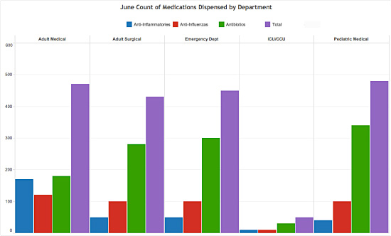
Now take a look at the same data displayed in a chart of small multiples:
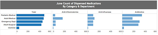
What problems does a small-multiples chart help solve?
- Multiple Variables. Trying to display three or more variables in a single chart is challenging. Small multiples enable you to display a lot of variables, with less risk of confusing or even losing your viewers.
- Confusion. A chart crammed with data is just plain confusing. Small multiples empower a viewer to quickly grasp the meaning of an individual chart and then apply that knowledge to all the charts that follow.
- Difficult Comparisons. Small multiples also make it much easier to compare constant values across variables and reveal the range of potential patterns in the charts.
Now, before you construct a small-multiples data display, here are a few additional pointers:
- Arrangement. The arrangement of small-multiples charts should reflect some logical measurement or organizing principle, such as time, geography, or another interconnecting sequence.
- Scale. Icons and other images in small-multiple displays should share the same measure, scale, size, and shape. Changing even one of these factors undermines the viewers’ ability to apply the understanding gained from the first chart to subsequent charts or display structures.
- Simplicity. As with most things in life, simplicity in the small-multiples chart is crucial. Users should be able to easily process information across many charts, and see and understand the story in the data.
I still go a little soft when I think of holding that darling lamb and patting its ears as it fell asleep in my arms. And while it is highly likely that this sweet memory will fade and I may eventually eat lamb once again, I will always remember seeing pasture after pasture of these gentle creatures and will continue to relate them to small multiples to display data!


0 Comments