In 1657, the French mathematician and philosopher Blaise Pascal apologized for a very lengthy letter he had written thus: “This letter is so long only because I had no time to make it shorter.” Over 350 years later, his words still resonate with me. I imagine that they do with you, too.
It’s hard work to communicate one’s thoughts and ideas briefly yet completely in writing. We need time – time to think, to try out different words and phrases, to solicit feedback, to edit (and edit some more). The same is true about the process of building overview monitoring dashboards to display healthcare data in a clear and compelling way: we need time – to grasp the underlying data and compose meaningful summaries; time to discover the best medium for and arrangement of the data, time to solicit feedback, to edit and refine the whole.
Sadly, we each only get 24 hours a day; I can’t help you much there. But I can share with you the approach I use, one I believe will help you use your time more efficiently as you develop really great overview dashboards.
The most important thing to do is step away from your computer and acquaint (or re-acquaint) yourself with both your colleagues and your whiteboard and markers. This idea doubtless sounds antiquated, but acting on it will make a huge difference: it frees you from worrying about or being distracted by the values in the data, and permits you to think contextually about the dashboard you need to create. Liberating your eyes from the computer screen lets you exchange ideas with your colleagues; using a whiteboard means that if something isn’t working, you can erase it and start over – no harm, no foul.
Think of all that this freeing step allows you to consider:
- The scope and role of the people using the overview dashboard, and what decisions they need to make. Are they responsible for many facilities and departments? If yes, then they need an overview summary dashboard that lets them monitor several locations on a single page (read more about this here).
- The data categories you have to work with. I can’t emphasize enough that you must NEVER skip this step: it is essential to being able to summarize and organize the data on an overview dashboard in a correct and meaningful way based on your viewer’s scope, role, and decisions.
- The context: “Compared with what?” Everything in data analysis and display is anchored in comparison. Do you have budget data, targets, previous results and/or group comparisons? If you can’t answer the question “compared with what?” your viewers will invariably end up saying “so what?”
Here’s a brief example of what I mean:
Imagine we’ve been asked to create an overview dashboard for the senior Quality Director for a multi-system organization. Asking the questions suggested above, we discover that
- her scope and role encompass numerous facilities and multiple performance measures. The high-level decisions she must make include identifying groups that may need help improving their performance on quality measures, and determining if there are measures that all groups need help on.
- the data categories she works with include the institutions delivering care and the quality metrics required by regulatory groups.
- the context of her decisions includes monitoring groups and measuring performance in comparison with each other. She has set performance targets for each group and each measure.
From a first review of the data, you learn that there is historical and current information available that may be categorized by facilities and measures.
Armed with the crucial gleanings summarized above from careful research and review, you can create an overview dashboard that will allow the director to consider the data in two useful, revelatory ways:
- Facilities: Anchoring the first view of the data to each facility allows the director to rate each facility’s performance, identifying those doing well, and those that need to improve. This view helps the director consider “whom” she may need to focus on.
- Measures: The bottom half of this example is organized by each measure, and allows the director to discern specific measure(s) that some or all facilities need to improve upon. This view enables a high-level identification of “what” should be the focus of improvement efforts.
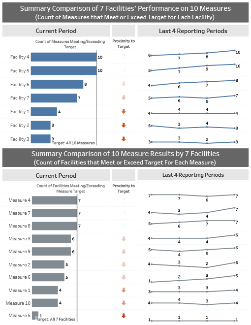
In this very simple example, I have created a summary view that lays out for the director, at a glance, the best- and worst-performing facilities, and makes it easy to quickly spot which facilities need her focused and immediate attention. My second display highlights specific measures needing improvement at multiple facilities.
Of course, supporting zoom reports are required to understand the underlying details, but at a very high level, this approach helps point the director in the right direction as she monitors results over time.
I wish the refrain from the song “Time is on My Side” (Mick Jagger and the Rolling Stones) were true in this case; alas, “It’s only Rock ‘n’ Roll.” (But I still like it.)


0 Comments