Years ago when I first worked at Mass General Hospital (MGH) in Boston, I had a really great boss, Dr. Dan Rosenthal. Like many smart people, he was also very funny. I especially loved his ability to use adjectives in a way that made you think he was going to tell you one thing, only to hit you with something entirely different.
Once, for example, I helped present a project that my team had been working on. In reviewing the results, Dan said, “Kathy, that was a spectacular…failure.” Ha! Very funny and very true, it had been just exactly that. Another time, I asked how he’d done in the half-marathon he’d run over the weekend. “Kathy, people are truly fantastic…liars,” he said. “At the 10-mile marker, everyone told me how great I looked – and that I shouldn’t worry: the finish line was close.” In my book, that is LOL good.
I was reminded of this last story while pulling together a recent presentation on data visualization – specifically about how data and information can be less than truthful, even downright misleading, when graphical displays are used incorrectly. A few examples follow.
A Quaker Oats ad claims that the cereal is a “Cholesterol Hunter,” and that by eating oatmeal every day for 30 days you can significantly reduce your cholesterol level. Here’s the trickery in the bar graph shown to support this claim: the scale begins at 196, and is so small that the change from week one to week four looks much larger than it actually is. The Center for Science in the Public Interest called Quaker Oats manufacturer General Foods out for its misleading claim and illustration, making it clear that it may take as many as four oat-product servings a day to get any benefit, and adding that a cholesterol level of 196 is still considered high.
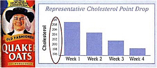
As I’ve written elsewhere, bar graphs must start at zero to prevent this sort of distortion. You can read more about why, and see alternative displays here.
There is also this example, from a Masters of Media blog post by Joram Binsbergen of the University of Amsterdam. He discusses an infographic used by the New South Wales Ministry of Health to illustrate an apparently significant increase in the number of nurses recruited by that country’s healthcare system from 2008-March 2013. On closer examination, however, the scale is completely off.
Four “people” icons on the far left of the graphic represent 43,147 nurses; on the far right, forty such figures stand for 47,500 – making a 7% increase look like a nearly 7,000% one.
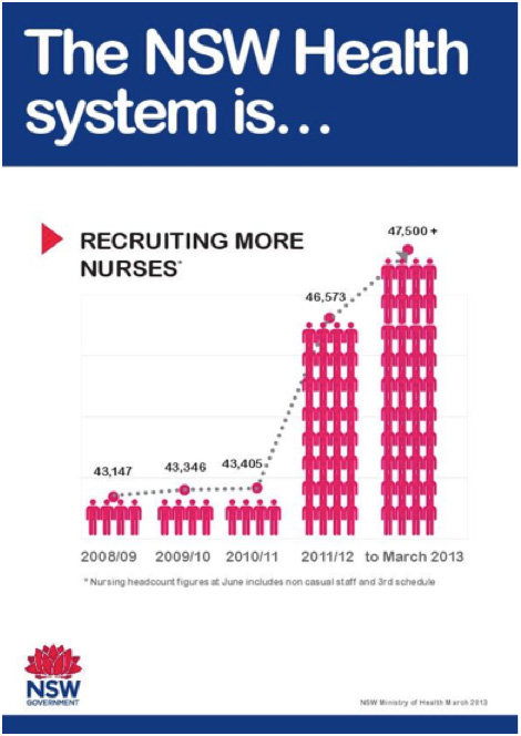
As Binsbergen points out in his post about this display, it is useful to consult Edward Tufte, who introduced the “Lie Factor” in his book The Visual Display of Quantitative Information: “The representation of numbers, as physically measured on the surface of the graphic itself, should be directly proportional to the quantities represented.”
My last example, from Andrew Gelman’s blog, “Statistical Modeling, Causal Inference, and Social Science” (sounds like a snooze, but it’s not – honest!), uses a misleading graphic in a story on medical fund-raising. Purporting to show how much money is raised to help fight specific diseases as compared to the mortalities attributable to those diseases, the zippy graphic is beyond distorting – it devolves into “hot mess” territory.
If for example you look at the large purple bubble on the right and match it to the key above it, heart disease appears to be the leading cause of death (596,577 deaths). I say “appears to be” because the key isn’t labeled to represent mortalities; rather, it says, “Heart Disease|Jump Rope for Heart (2013).”
Now look at the much smaller purple bubble on the left, labeled $54.3 million. If you’re puzzled, that’s a good sign: confusion signals awareness of a large, awkward problem. That left-hand bubble – it would seem – represents just one fundraiser for heart disease (“Jump Rope for Heart”), as compared to all deaths from heart disease.

A quick internet search of “heart disease” led me to this summary document, which made me dismiss the illustration in its entirety.
You may never create a graph, chart, or table, but you will, like most of us, assuredly consume, even depend on, graphic displays. As with all consideration of important and complicated information, I encourage you to slow down, take a breath, and ask yourself, “Does this make sense? Can I believe what is being presented?” And what is more important, “Can I learn something true here, or make a confident decision based on what I think I’m seeing?”
Remember, even information displayed in a pretty graph can be incredibly misleading. Or, as Dan Rosenthal would probably say, “fabulously terrible.”


0 Comments