I’m a long (long)-time devotee of the iconic Marimekko designs and textiles. I have Marimekko clothes (I’m sure they’re considered vintage now), and in my daughter’s bedroom I splurged on yards and yards of custom drapes made from Marimekko’s Pieni Unikko Blue fabric.
They are big and bold, and make a huge first — and lasting — impression. My family can bury me with those drapes, and I will pass into my next life a very happy woman (I kid you not).

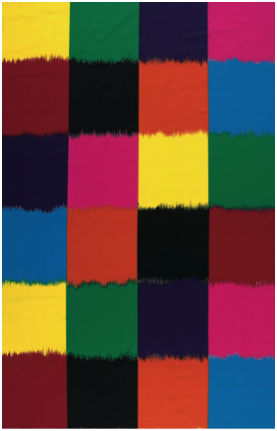
Some Marimekko designs are geometric, like this one (below), called Ostjakki Print — and yes, you guessed it, they have been the inspiration for a type of data display called a Mekko Chart.
At the risk of being a killjoy YET AGAIN, I will say that Mekko charts can be fun to look at and play around with; but as evolving research is helping us figure out, what we like and what is best for allowing us to examine and understand data are often two entirely different things. Sort of like the candy versus carrot conundrum.
Below is an example of an interactive Mekko chart. It was created by Josh Cothran (Georgia Institute of Technology) for the California Health Care Foundation (CHCF) to display U.S. healthcare expenditures:
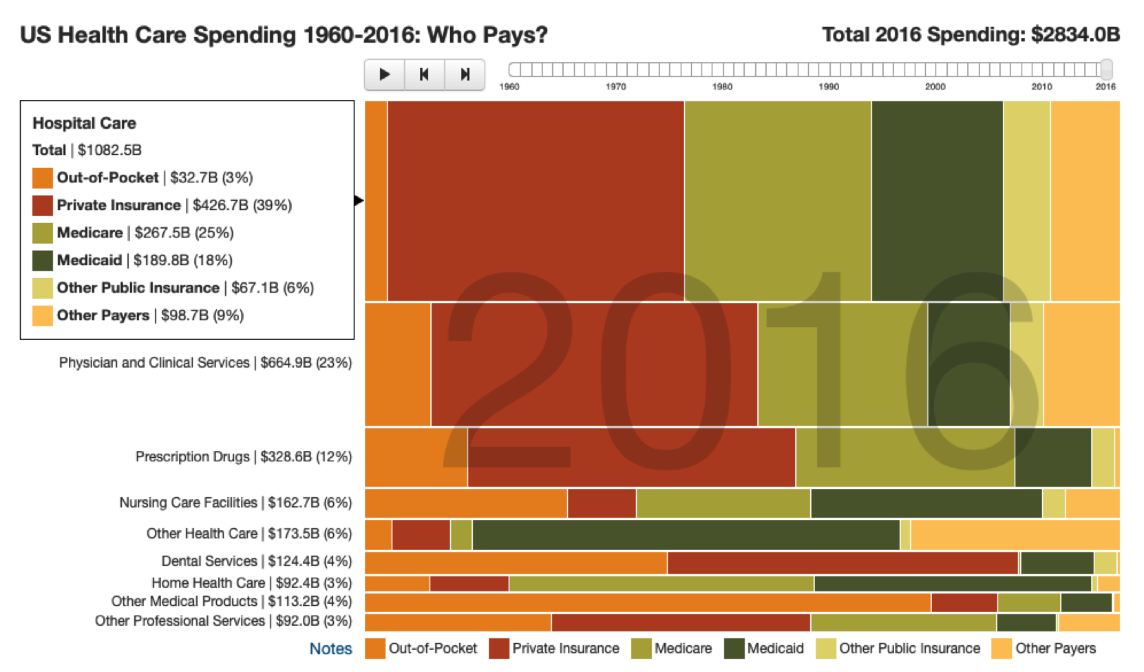
This Mekko chart illustrates healthcare expenditures by two variables: service and payor.
Each row shows a type of service (hospital care, prescription drugs), and each colored section of the bar represents a payor (Medicare, Private). The height of the row represents how large that particular service type is compared to all other services being displayed; the width of the different colored sections represents each payor’s portion of that service type.
You can get a general sense of the different service values in this display, and of which ones are larger or smaller, through the height of the rows (labels provide the specifics), but it’s hard to compare these heights directly.
Services aren’t ranked, making it difficult to consider the magnitude of spending in an ordered way. It’s also just about impossible to understand and compare the different colored sections of the bars, because they begin and end at different places on the scale.
And although you can hover over a section to view details, it is virtually impossible to hold all the information presented in short-term memory and make comprehensible comparisons; we simply aren’t wired to do this (which is why we use a technique called “ chunking” to help us remember things like phone and Social Security numbers).
Now consider a different display of this information that I collaborated on with our newest HDV team member, Lindsay Betzendahl (thank you, Lindsay!).
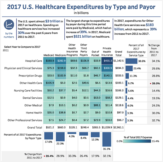
In this new display of the data, we have used a simple heat map to directly display the expenditures by both service type and payor, with the darker saturation of blue representing the higher values.
Additionally, the rows are used to rank the expenditures from high to low, based on the overall percentage of service-type expenditures, which is also clearly displayed in the accompanying bar chart on the right side of the table.
More contextual information is displayed in an accompanying set of figures in the far right column, which shows the percentage of change in the amount spent in each category from 2011 to 2017.
A similar treatment is used at the bottom of the table for payor type, where you can view the expenditures by each payor, their proportion to the total, and how this relationship changed from 2011 to 2017.
Now we can easily see and understand all the information being displayed.
For example, in 2017, the largest expenditures (more than $1 trillion) were for hospital services at 38.6%, and Private Insurers paid the largest share, at $455 billion. We can also see that all hospital expenditures increased from 2011 to 2017 by 34.1%.
Interestingly (but not surprisingly, given the expansion of Medicaid under the Affordable Care Act|ACA), we can see from the figures at the bottom of the display that the largest change in payor expenditures from 2011 to 2017 was attributable to an increase in Medicaid spending of 39.4%.
Cool graphs are indeed very cool, and I understand their ability to wow an audience. But when we step back and think critically about what we can easily comprehend and explain while viewing them, versus what we can understand and convey via less dazzling displays of the same data, we find (and remember, there is emerging research to support our discovery) that the oft- misunderstood and dismissed wall-flower of displays is the most effective, time and time again.
And remember, folks, at the end of the day it is our job to make health and healthcare data clear, comprehensible, and compelling — even if it doesn’t look as handsome as a set of vintage Marimekko sheets.


1 Comment
Christopher Majka · February 5, 2019 at 12:25 pm
Great post – and so very true!